AboutProjectsResumeContact

Reimagining the McDonald's Mobile Experience

Reimagining the McDonald's Mobile Experience

Reimagining the McDonald's Mobile Experience

Project Overview

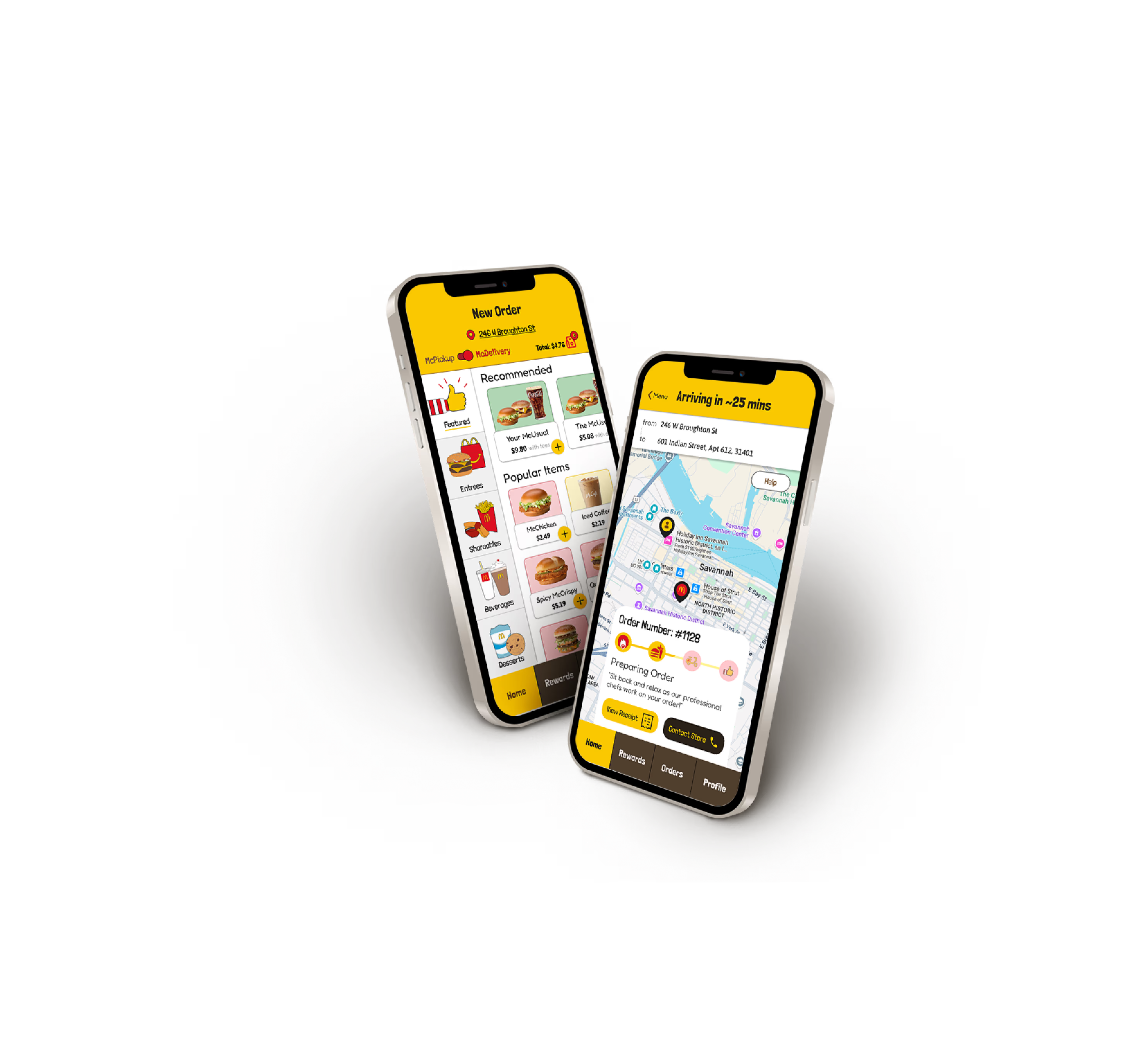
In this redesign, I transformed the McDonald’s mobile experience from a static, transactional interface into an energetic brand destination by bridging the gap between digital efficiency and the brand’s identities of fun, affordability, and speed. By synthesizing research into user "pains" like reward fatigue and menu complexity, I engineered a solution that balances high-speed functionality with strategic delight. The core of the redesign features a streamlined 5-step ordering flow, a color-coded reward system for instant recognition, and a gamified "Rewards Roulette" that personalizes deals based on user's ordering behavior. By layering bold typography and micro-animations over a high-contrast grid system, I created an interface that doesn't just look like McDonald’s, but acts like it: instantly recognizable, intuitive, and designed to turn a routine purchase into a memorable brand experience.

Project Type

SCAD Course:
GRDS 323

Timeline

April - June 2025

Role

UX Designer

Tools

Figma

Unique

Visual Style

A vibrant redesign blending bold colors, lively interactions, and oversized food imagery to reinforce McDonald’s energetic spirit.

Intuitive

User Journey

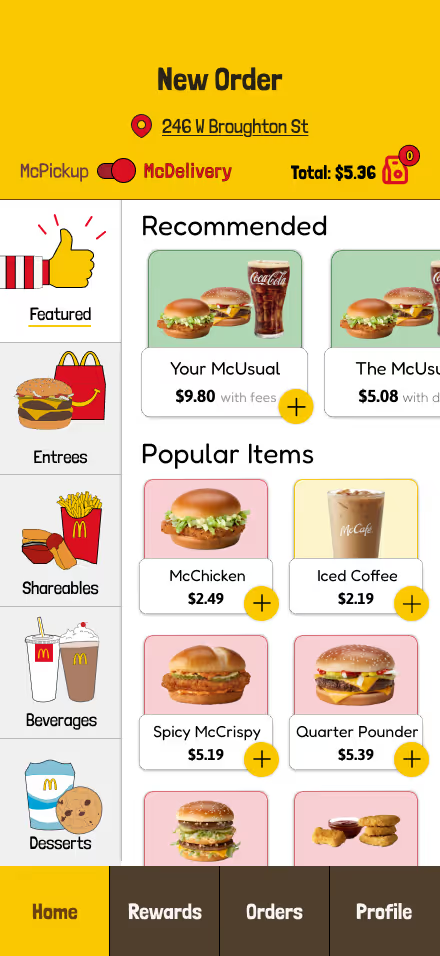
Order your meal in just 5 steps!

Introducing the Recommended Order. McDonalds knows what you want, before you even open the app based on your past orders.

A view similar to the kiosks within the stores. The design allows users to easily find what they are looking for, while offering a unqiue visual experience.

Prioritizing efficiency, users can effortlessly access their usual or past orders and make on-demand customizations as desired, bypassing the need to search or navigate through individual menu components.

A dedicated, efficient step is provided for users to perform any final changes their order before moving into the checkout process.

To speed up re-ordering, the application retains the user's previously used order addresses.

Following user verification of all order details, the request is dispatched to the corresponding McDonald's kitchen, where order preparation commences immediately.
Gamified

Rewards System

The existing McDonald's Rewards system, overloaded with points, coupons, and deals, results in low feature utilization among users, necessitating a simplified, high-value solution that extends beyond basic affordability.

Post-order, users engage with a reward wheel offering one of three coupon categories. Results are algorithmically skewed toward frequently purchased items and relevant deals, ensuring a highly personalized experience that maximizes coupon utility.

Coupons are organized into three color-coded categories: Red (Entrees/Sides), Yellow (Drinks/Treats), and Green (General). This visual system enables users to instantly pick the right coupon.

Excitement

Through Motion

Animations that bring Delight!

To express the fun side of McDonald's, I used delightful micro-animations as emotional anchors at key touchpoints. These moments are strategically sprinkled throughout the user flow to build and sustain excitement, driving users toward completing their order.
Featured Animations
Place Order
Rewards Roulette

On-Brand

Typography

Lodrina Solid was selected for its bold, rounded aesthetic, which perfectly aligns with McDonald's familiar and playful brand identity.

Lodrina Solid was selected for its bold, rounded aesthetic, which perfectly aligns with McDonald's familiar and playful brand identity.

Final

Prototype

Project

Takeaways

1

Balancing Fun and Usability

Designing for a fast-food context meant managing a strict tension between brand personality and high-velocity utility. I had to ensure that 'fun' elements served as rewards for progress rather than obstacles to the order. By treating the energetic visuals as a secondary layer to the core task, I maintained the speed and clarity users expect from McDonald’s.

2

Crafting Moments of Delight

I integrated small, natural moments of delight throughout the flow to bridge the gap between digital utility and the nostalgic McDonald’s experience. By celebrating user milestones, like completing a custom order, with energetic feedback and brand-aligned motion, I maintained high engagement throughout the ordering process.

3

Bringing the Brand to Life

I translated the McDonald’s experience into a digital interface by layering bold typography with custom motion graphics and iconic brand characters. I built an environment that feels energetic and recognizable. By combining large-scale imagery with fluid transitions and 'Easter eggs' featuring Ronald McDonald, I ensured the UI was an extension of the brand's friendly, nostalgic legacy.

The Story

Behind the Interface

Understanding the Market

Defined by its focus on speed, affordability, and a globally consistent franchise model, the fast-food industry is one of the world's most hyper-competitive food markets. This intensity necessitates that every major participant, including McDonald's, must continually differentiate its brand and service model to capture and retain market share.

What makes McDonald’s Unique?

While originally defined by speed and affordability, McDonald’s brand identity has evolved, particularly for modern audiences who associate the brand with the fun and familiarity of the Happy Meal experience. This shift makes Fun, Fast, and Affordable McDonald’s unique strategic advantage. The brand now holds a unique opportunity to redefine the digital fast-food experience by leveraging these core values in a modern, fast-paced context.

Social Media Research

To holistically understand customer perception beyond the app, I focused on Social Media Research, analyzing McDonald's presence on Instagram, Reddit conversations, and popular blogs. This research was crucial in revealing significant gaps between current customer sentiment and the existing app's digital experience.

Deals Drive Engagement

trategic deals and rewards are proven to be more effective than base-level low prices, as customers prefer higher-cost items when associated with a promotion.

Fun Builds Connection

While McDonald's social presence feels lively and human, the existing app fails to fully translate that playful energy, consequently revealing a critical disconnect.

Intuitive Interfaces Matter

McDonald's kiosks set a global standard for simplicity, enabling even non-local language speakers to order easily. The existing app fails to deliver this level of intuitive clarity.

The Target Audience

McDonald’s has a broad target audience which can be widely divided into four demographics:

Young Teens | Jeremy Davis, 16

“McDonald’s is where I hangout after school with my friends. I want dinner to be fun and fast so I don’t miss curfew.”

Goals:
  • Enjoy a fun, memorable meal with friends
  • Spend within his allowance
  • Finish dinner quickly to beat curfew
Frustrations:
  • Lack of excitement in the ordering process
  • Slow ordering due to unintuitive menu
  • Complicated reward system makes it hard to get the best deal

College Students | Arnold Min, 21

“My dorm doesn't have a kitchen, and I just need a quick bite as a finish my homework before bed.”

Goals:
  • Doesn't want to spend time thinking about what to order
  • A fast, hands-off experience with food delivered to their doorstep
  • Save money with affordable food
Frustrations:
  • The experience feels laggy and requires too many inputs to place their order
  • The desired item is unexpectedly unavailable
  • Selecting the best deal and order combination requires too much thought

Young Professionals | Aaron Paulsen, 25

“I usually order ahead, walk over, and pickup McDonald's during my 20 minute lunch break."

Goals:
  • Quick ordering and seamless tracking
  • A hands-off overall experience
  • Select the optimal deal without much thought
Frustrations:
  • Difficulty tracking order progress in the app
  • Slow group ordering experience due to unintuitive menu navigation
  • The interface isn't drive friendly.

Parents & Caretakers | Amelia Parsons, 32

“I like treating my kids to McDonald's after their soccer games.”

Goals:
  • Kids should have a fun time
  • Kids want the new Happy Meal toy
  • Finish the meal quick and get home before bed time
Frustrations:
  • Order takes longer than anticipated
  • Kids get confused while ordering their food through the app
  • Unsure whether food items are available depending on time of day

Pains & Gains and Insights from Competitors

This section synthesizes the Pains and Gains identified through preliminary research. Each critical finding is validated with a competitive case study, presenting a successful design example that addresses the respective challenge or opportunity. These insights were directly leveraged to strategically inform and shape the final product design.

Pains

Gains

Pain: Complicated Menu

Distinctions between breakfast and lunch are unclear. In addition, McDonalds has many unique menu categories which makes it trickier to create an easy to navigate interface.

Case Study: Chick-Fil-A
Reason for selection: Chick-fil-A is a direct competitor of McDonalds in the fast food industry with similar menu items.
Takeaways:
  • Items are broadly grouped by quantity of food.
  • Within these groups, items are presented in order of popularity.
  • Limited/featured items are shown on the top and draw attention to them. 

Pain: Rapid Digitization

In many McDonald's restaurants, customers order and receive their meal without any human interaction. Though fast/efficient, it distances McDonald’s, and makes their food and experience feel impersonal and processed.

Case Study: Chess.com
Reason for selection: Chess was originally played using a physical chess board as the players faced each other. Chess.com successfully digitized this experience
Takeaways:
  • Utilizes friends, avatars and colored icons
  • Humanizes the bots with voice lines and avatars
  • Statistics and scores provided are calculated relative to other players which makes the user feel less “alone”

Pain: Complex Navigation

The mobile ordering experience creates many opportunities for user error and requires multiple unnecessary inputs to complete simple tasks, resulting in higher drop-off rates.

Case Study: Guitar Tuna
Reason for selection: The experience is highly intuitive,  and requires very little interaction with the interface to effectively tune the user's guitar
Takeaways:
  • Immediately gets into the main feature
  • More interactive than textual, but the UX writing is very clear
  • Powerful use of visualization and imagery

Pain: Unclear Brand Identity

The McDonald’s values of “fun”, “fast”, and “affordable” lack unity, resulting in inconsistent design styles that make it harder to build customer brand loyalty.

Case Study: Dunkin'
Reason for selection: Dunkin’ is a direct competitor in the fast food breakfast industry. They underwent a large rebranding from Dunkin’ Donuts
Takeaways:
  • They are intentional about the order of menu items
  • Donuts are off to the side, but still present
  • Users can still recognize the company as a rebranding of  "Dunk'n Donuts"

Gain: Seamless Experience

Users desire an ordering and tracking experience that can be conducted with minimal attention and inputs. This requires an intuititive experience where users have spend very little time performing these tasks.

Case Study: Hello Fresh
Reason for selection: Hello Fresh automatically sends a box with ingredients and recipes to make food from the user’s preferred dietary plan without any user input each week.
Takeaways:
  • Remembers previous selections to offer a personalized experience
  • User is placed into an "archetype" which helps recommend recipes
  • User can see exactly what they are getting each weak and customize their orders as desired.

Gain: Fun and Interactive Experience

There needs to be an alignment of the social media identity and the interface identity that communicates the “fun” energy of McDonalds with its characters and Happy Meal.

Case Study: Duolingo
Reason for selection: Duolingo is known for their gamification of the difficult task of learning languages, prompting users to further engage with the brand.
Takeaways:
  • Uses avatars and characters to create an immersive experience
  • Offers an extremely personalized experience with profile, friends, and road map
  • They have a very strong social media presence that is reflected across all their platforms.

Gain: Affordable Pricing

The rewards and deals make the user feel like they are getting a more expensive product for a lower price, encouraging them to be returning customers.

Case Study: Little Caesars
Reason for selection: Little Caesars is well known for their affordable food options and outstanding deals.
Takeaways:
  • Every advertisement and hero image features their deals and low prices
  • Landing page on the website immediately shows off deals
  • Orange shade is everywhere. It makes the user associate the color with the brand and affordable prices

Gain: Personalized Experience

Distinctions between breakfast and lunch are unclear. In addition, McDonalds has many unique menu categories which makes it trickier to create an intuitive experience.

Case Study: Youtube
Reason for selection: Youtube has a custom curated feed for each user, offering a hyper-personalized experience
Takeaways:
  • Recommendations follow what was watched
  • Places users into "archetypes" and displays content other users with a similar interests interact with
  • Makes it so the user doesn’t have to think about what to watch, the next video is already there

Creating User Flows

Redesigning the application's information architecture required simplifying a complex menu while preserving critical functionality. I focused on reducing user friction and cognitive load by reorganizing the flow around popular actions and task prioritization. The goal was to ensure core tasks, like ordering and accessing rewards, could be executed with maximum efficiency and minimal inputs.

Mid-fidelity Wireframes & Feedback

The mid-fidelity wireframes served as the foundation for testing flow, navigation, and information hierarchy. By intentionally stripping away visual elements, the focus was to validate if users could complete core tasks (e.g., finding deals, placing orders) with maximum efficiency and minimal cognitive load. These wireframes were refined just enough to conduct concept testing and validate the architectural direction before proceeding to high-fidelity design.

Menu items feel too large

"I would like to see more menu items on the screen at a time to browse through options quickly."

Too gamified for a quick food ordering experience

"I probably wouldn't interact with this feature too much since my main goal is just to get cheap food quickly."

Hard to visualize without the colors

"I like the idea of categorizing the different types of  coupons, but I can't imagine this feature without seeing the colors."

Hi-Fidelity Prototype

Utilizing user testing feedback, I iterated and refined the delicate balance between gamification and usability. The application of the final color palette, brand imagery, motion, and typography successfully brought the playful McDonald's brand to life while maintaining a streamlined, high-efficiency experience. Critically, features such as surfaced deals, faster reordering, and intuitive navigation all tie directly back to the initial research and strategic goals, resulting in a final prototype that is both fun and highly functional.