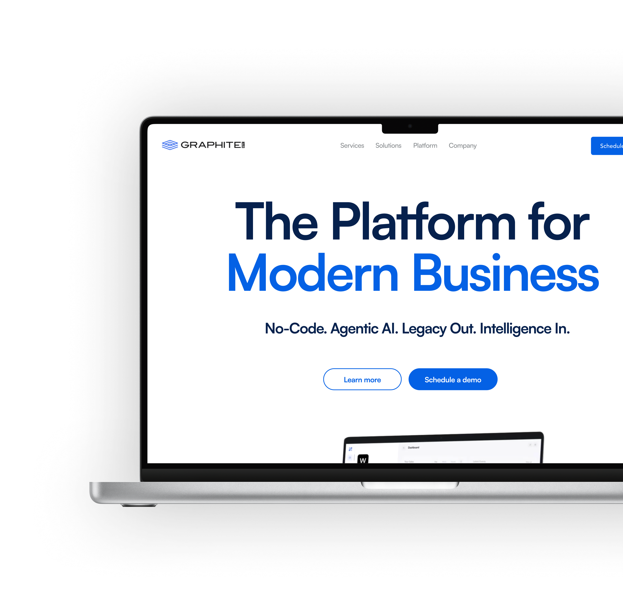
Graphite GTC needed a new client-facing website to establish their digital presence, but the design concepts existed only as static Figma mockups. The challenge was translating those high-fidelity designs into a fully responsive, production-ready site that felt polished and dynamic capable of competing against some big brand names.
I built the site in Webflow, using grid systems and metric-based layouts to ensure visual consistency and responsiveness across all breakpoints. Additionally, I incorporated strategic micro-interactions and Lottie animations, and partnered closely with the Lead Designer through detailed reviews to ensure the final build aligned with his design vision.
The final product was a fully responsive, visually polished website with dynamic micro-interactions and a clean codebase built for long-term scalability. Working within real sprint cycles alongside a Lead Designer sharpened my ability to iterate quickly and maintain stakeholder alignment throughout a build.
I ensured a pixel-perfect and naturally fluid experience across desktop, tablet, and mobile. By structuring the build with modular components, the final product was not only polished but also established a scalable foundation for maintenance.
I significantly enhanced the site's quality by incorporating strategic micro-interactions and Lottie animations. This transformed the static Figma layouts into a dynamic and engaging experience, adding polish and visual fidelity.
To ensure a seamless and long-term handoff, I structured the Webflow project for easy maintenance. This involved rigorous adherence to clean, consistent code practices and using clear variable naming conventions.

I operated effectively within weekly sprint cycles, adapting to evolving priorities and rapidly refining deliverables. This required proactive communication to maintain continuous alignment with the Lead Designer and technical stakeholders, ensuring all work was ready for integration.
I significantly deepened my ability to translate high-level strategic intent into fully realized interactive experiences. This involved systematically interpreting the design vision, ensuring every interaction and nuance achieved the intended user experience and functional parity.
I consistently focused on laying the groundwork for a robust system by creating reusable, modular components and scalable metric-based layouts. This systematic approach ensured the site remained visually consistent and functionally flexible, establishing a future-proof foundation for all scaling initiatives.
